

CASE STUDY
Tool Battles Visual & UX Update
After launching Tool Battles in early 2024, I saw fast traction, but it didn’t take long to identify friction points in usability, especially around product discovery and submission. This case study covers how I redesigned parts of the platform to improve UX flow, visual hierarchy, and overall product interactivity, resulting in better engagement, user retention, and more frequent product submissions.
[ If you would like to learn more about the development & building of Tool Battles, please visit this case study. ]
- Updated: April 11, 2025

The Problem
I initially shipped about 80% of the MVP in under 2 weeks. That velocity helped me validate quickly, but it also meant design trade-offs. Through behavior tracking (like MS Clarity and Google Analytics), I noticed:
- Users weren't spending much time on product pages
- Submission flow was longer than expected
- Navigation was unclear and overloaded
- The information architecture was rushed, which affected both discoverability and conversion
- Users were bouncing before fully exploring
The Goal
Refactor the UI/UX to:
- Increase dwell time & interactivity on Product pages
- Improve Product discovery
- Reduce friction in the product submission process
- Create a clearer visual identity for brand trust
My Work/Roles
- UI Design
- UX Strategy
- Visual Identity
- Frontend Development
- Feature Iteration
Time to complete:
- ~3 weeks
The Results
Decrease in Time-to-Submit a product
Down from an average of 2:30 to 1:30 with
more data input fields
Increase in pages per session
From 1.97 to 4.27 pages
viewed per session
Increase in weekly new user sign ups
From 3 users per week to
22 users per week
What I Changed
Logo & Visual Identity
I wanted the visual identity to reflect trust, simplicity, and modernity without over-branding.
I created a minimalist “T” lettermark to represent Tool Battles, drawing from the angles and geometry of a bolt or bracket (tool-adjacent). I paired this with a tech-forward color palette of deep blue, black, and grays to evoke reliability and cleanliness.
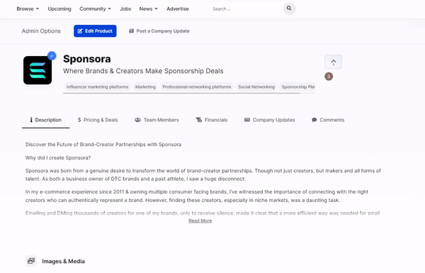
UI Cleanup & Layout Simplification
Problem: Submission forms had grown, but the layout hadn’t evolved. Pages felt heavy and confusing.
I observed confusion in click maps and long scroll times on product pages. Users often missed important data due to clutter.
Solution:
- Introduced tabbed content areas to organize product data
- Moved secondary metadata into a sidebar structure
- Simplified dropdowns and removed redundant filters in search
- Refactored the navigation to emphasize discoverability
This kept high-priority content visible, while reducing noise for the user.
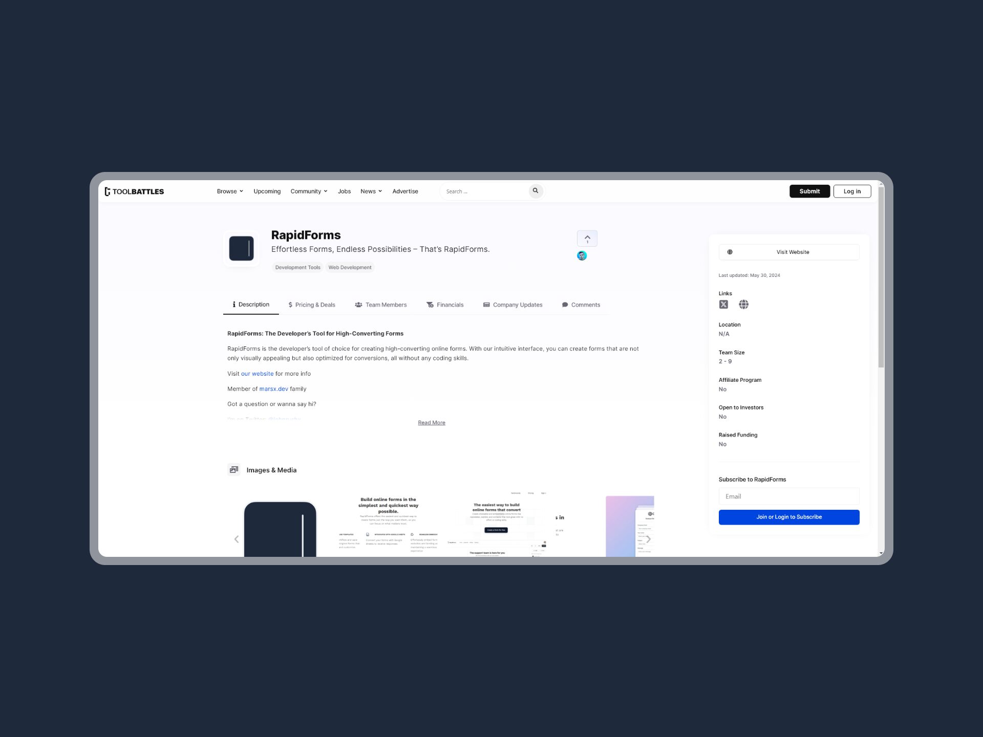
UX & Editing Flow Improvements
1. Editing Flow
Originally, product owners could only edit from their dashboard; a disjointed flow. Users messaged me asking how to make changes.
I redesigned the flow by:
- Adding inline admin controls directly to the product page (only visible to owners)
- Implementing security logic to ensure access control
- Tracking edit frequency and completion — which increased post-update
2. Company Updates
Users wanted to share feature launches or news, but had no way to post.
I added a lightweight “Company Update” feature:
- 2-field modal for posting quick updates
- Displayed in the product’s Updates tab
- Posts auto-tagged by date and linked to the submitting user
This gave companies a voice and made their pages feel more “alive.”
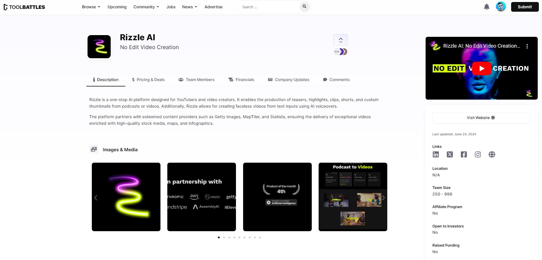
3. Live Search
I added a live search bar to the main nav with instant filtering for tools, founders, and companies, improving engagement and speed of navigation. Search result pages were custom built to show aggregated results.
Bug Fixes & Platform Stability
As with most MVPs, the launch exposed edge cases & smaller bugs:
- Random deletion of pages on save
- Race conditions in scheduling logic
- Overflow text issues in card views
- Rendering glitches from third-party updates
Most issues were resolved within 2–3 days, and I added automated fail states to prevent recurrence.
SEO & Page Optimization
Tool Battles is an evergreen content platform, so I doubled down on SEO-friendly surfaces:
- Added framework for product comparison pages, category landing pages, and platform alternatives
- Created modular components for press releases and founder bios
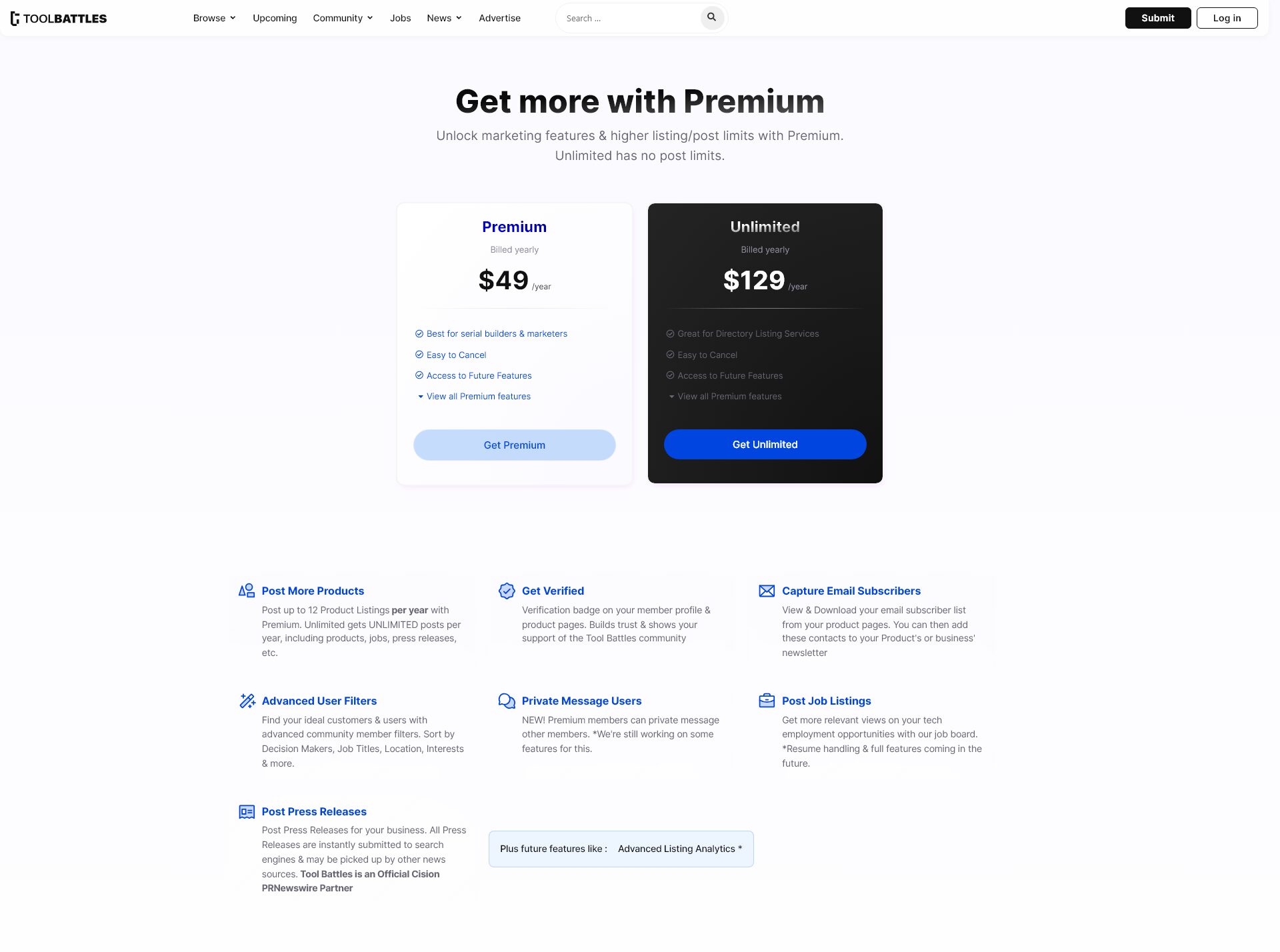
- Refined the membership upsell funnel
All of these played into a growth flywheel to support the platform’s long-term visibility and search indexing.
What I Learned
- Don’t rush IA. Speed is great, but clarity builds trust
- Visual hierarchy is an invisible UX multiplier
- Even as a solo builder, you can ship real traction if you prioritize user feedback and iteration
- UX debt compounds fast. Small fixes early save time later
- Friction isn't always obvious. Watch the behavior, not just the analytics
Final Notes
This wasn’t just a facelift, it was a full UI/UX refactor grounded in real user behavior.
It taught me how to spot invisible friction, ship fast, and build intentionally not just beautifully.
I believe modern platforms should scale with clarity, not clutter.
Tool Battles is starting to reflect that.